🎨 Color Psychology in Branded Merchandise: Smart Design Tips
- 🎨 Color Psychology in Branded Merchandise: Why It Matters
- 🧠 How Color Psychology in Branded Merchandise Impacts Recall
- 🖼️ Smart Logo Placement
- 🧰 Using Color Psychology in Branded Merchandise Design
- 📐 Examples of Color Psychology in Branded Merchandise
- 🚀 Implementing Color Psychology in Your Swag Strategy
- Final Thought
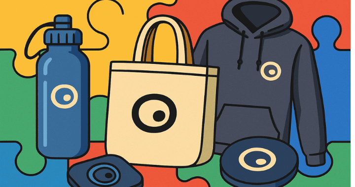
Color psychology in branded merchandise is more than just a design choice, it’s a strategic tool that influences how customers perceive, connect with, and remember your brand. Whether you’re handing out branded hoodies, water bottles, or event giveaways, the colors you choose and how you place your logo play a direct role in brand recall, emotional impact, and long-term ROI.
When it comes to color psychology in branded merchandise, even small design choices can influence how people perceive and remember your brand.
Color psychology and logo placement aren’t just design decisions. They’re strategic brand levers. In the competitive world of promotional products, the right shade or logo layout can make your swag look premium, purposeful, and irresistible.
Whether you’re a brand manager designing an event kit or a startup refreshing team gear, this guide will show you how to use color and placement to maximize visual impact and brand recall.
🎨 Color Psychology in Branded Merchandise: Why It Matters
Color speaks before words do. It instantly triggers associations, emotions, and even behavioral responses, all before someone registers your logo.
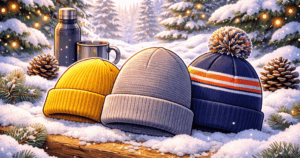
Here’s what some common colors communicate in the context of custom merch:
| Color | Emotion / Message | Great For |
|---|---|---|
| Blue | Trust, calm, professionalism | Finance, tech, consulting |
| Red | Energy, urgency, confidence | Startups, retail, fitness |
| Green | Growth, wellness, sustainability | Health, eco brands, HR |
| Black | Luxury, authority, boldness | Premium swag, executive gifting |
| Yellow | Optimism, creativity, friendliness | Startups, internal morale |
| White | Simplicity, cleanliness, neutrality | Medical, SaaS, co-branding |
| Purple | Imagination, prestige, innovation | Creatives, beauty, DEI events |
Color can even influence perceived product quality. According to a 2023 Canva color psychology report, consumers consistently rate darker tones as more “premium,” while bright hues signal fun and approachability.
Pro Tip: Match your swag color not only to your brand palette but to the emotion you want the product to evoke.
🧠 How Color Psychology in Branded Merchandise Impacts Recall
Did you know that up to 90% of snap judgments about a brand’s merch can be based on color alone?
Using your core brand color consistently across swag items helps reinforce recognition. But you can also get strategic with secondary colors to signal different campaigns or values. For example:
- Use green-accented merch to promote your sustainability pledge
- Choose white-on-black prints to stand out at a corporate trade show
- Opt for metallics (silver, gold, gunmetal) to elevate your holiday gifting kits
Mini Case Study:
A fintech startup gave away two versions of their branded tumbler at back-to-back conferences. The first version used their standard navy on silver. The second? They swapped navy for a bright cobalt lid and neon-blue wraparound text. Booth traffic tripled at the second event, and over 120 attendees posted their swag on LinkedIn.
Color isn’t decoration. It’s ROI.
Already Have Something In Mind?
Skip The Guesswork. Browse Our Custom Swag Catalog.
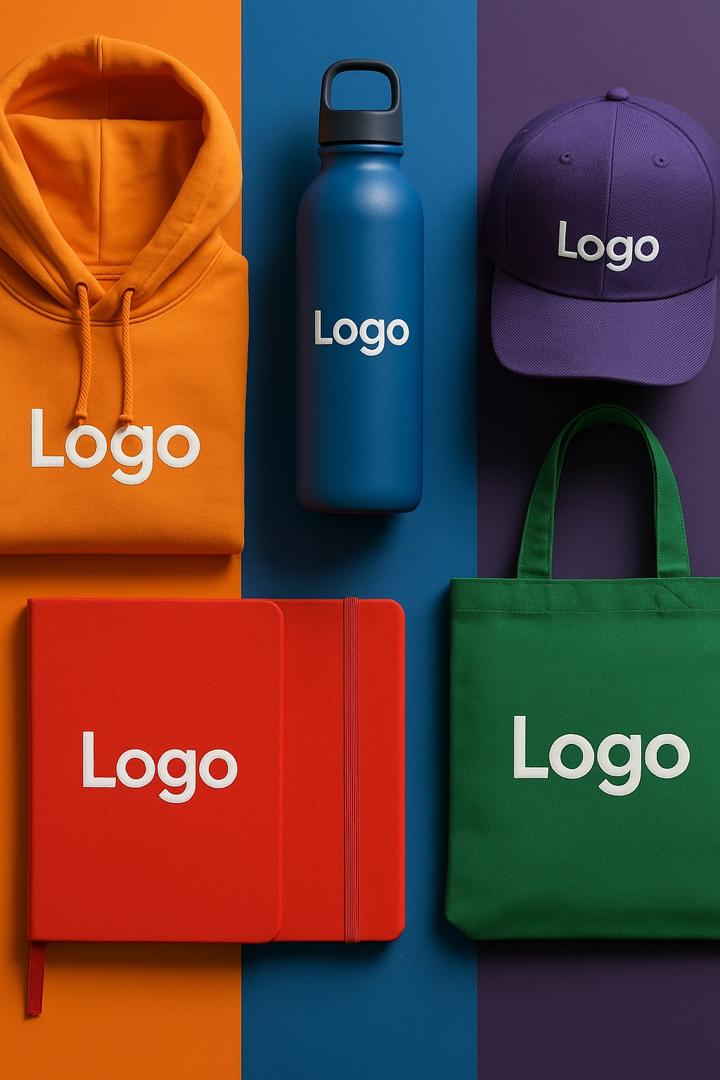
🖼️ Smart Logo Placement
Where you put your logo affects everything from visual hierarchy to usability. Let’s break it down:
| Item Type | Ideal Logo Placements | Notes |
|---|---|---|
| T-shirts & polos | Left chest, sleeve, back yoke | Subtle but visible in group photos |
| Water bottles | Vertical side panel | Avoid putting logos on the lid, as it gets lost |
| Backpacks & totes | Top-center flap, side panel | Think about orientation when worn |
| Notebooks | Bottom corner, center front | Debossing works great here |
| Tech items | Front face or top panel | Keep clear of functional elements like buttons or screens |
Logo placement should balance brand visibility with product usability. Overbranding, such as plastering logos across every surface, can backfire, especially in high-end environments.
Less can be more. Subtle placements or tone-on-tone prints often read more premium and increase daily use.
🧰 Using Color Psychology in Branded Merchandise Design
Smart swag design doesn’t just look good, it works well. Here’s how to make design choices that drive actual product use:
- Avoid design elements that interfere with functionality. For example, don’t print your logo where someone grips the mug because it’ll wear faster
- Use high-contrast logos on dark materials, or inverse logos (light on dark) to improve readability
- Co-branding? Consider placing your logo alongside a campaign hashtag or internal motto, like “#BuiltTogether” or “Q4 Recharge Box,” for emotional connection
Minimalist designs also trend well. Try embossing, etching, or thread-matching for an understated, elevated look.
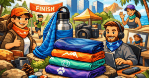
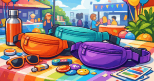
📐 Examples of Color Psychology in Branded Merchandise
Here are some popular swag products where color and logo placement make all the difference. Click Explore to browse customizable options directly.
| Product | Color Psychology Tip | Logo Placement Suggestion | Link |
|---|---|---|---|
| Stainless steel tumbler | Choose matte black or navy for sleek, executive appeal | Laser etch near base or vertical wrap | Explore |
| Softshell vest | Darker tones like charcoal or black convey seriousness and style | Left chest or back collar | Explore |
| Custom mouse pad | Use bold or bright colors for fun, desk-friendly visibility | Centered or top-left print to avoid interfering with mouse use | Explore |
| Wireless charging pad | For sustainability-forward brands | Centered, avoid USB area | Explore |
| Cotton tote bag | Natural canvas gives an eco-friendly feel | Side print or bottom edge | Explore |
✨ Signature Swag Moments
The right design choices can drive real results. According to industry research from the Promotional Products Association International (PPAI), 83% of people can recall the branding on a promotional product they received and 79% say they’re more likely to do business with the brand afterward. When you combine high-quality merch with thoughtful design, you increase the odds it gets used, remembered, and talked about.
SwagZone clients have used color tweaks, smarter placements, and upgraded materials to elevate everything from employee welcome kits to event giveaways. It’s not about spending more, it’s about designing smarter.
🚀 Implementing Color Psychology in Your Swag Strategy
Here’s how to make sure your next round of merch nails both function and form:
- ✅ Audit your brand colors for emotional impact and versatility across materials
- ✅ Choose placements that balance visibility with everyday use
- ✅ Always mock up your product before production and test print when possible
- ✅ Think beyond the logo, include slogans, mission words, or event names for context
- ✅ Collaborate with your vendor or SwagZone’s in-house design team to get placement right
Color and placement aren’t just the cherry on top. They’re core to whether someone wears, uses, and remembers your swag.
Final Thought
Design isn’t an afterthought when it comes to branded merchandise. It’s the difference between a giveaway that ends up in a drawer and one that earns daily use, builds brand affinity, and sparks conversation.
By understanding how color psychology shapes perception and how logo placement impacts usability, you can turn ordinary swag into a high-impact brand asset. Whether you’re refreshing internal team gear or launching a new client campaign, these small design choices carry big weight.
At SwagZone, we believe great merch isn’t just branded, it’s well-designed, well-placed, and well-used.
Looking to build a swag program that people actually love?
Explore hundreds of customizable items that match your brand style, values, and goals.
Or talk with our team for personalized design help. No pressure, just smarter merch.
GET IN TOUCH